Adding Features
Turning on features is as easy as adding one attribute to the <zing-grid> tag or adding some components to the grid as child elements. ZingGrid comes with many native features, from content filtering and sorting to editing cell/row data and custom-data display. All features are optional and can be added on a per-grid basis to allow you to accommodate the individual dataset. In this guide, we'll walk you through adding features to your ZingGrid via attributes, tags, and columns.
Adding Attributes
The easiest way to add a feature to the grid instance is by adding attributes to <zing-grid>. Some features require just the attribute, while others allow you to pass a value to the attribute.
For example, to add a title to the grid, just add a caption attribute with your caption text as the value, like so:
<zing-grid
  caption="Employees"
  src="https://cdn.zinggrid.com/datasets/remote-data.json">
</zing-grid>
Adding more features is as simple as adding more attributes. For example, you can add:
sortto enable ascending, descending, and default sorting functionalitysearchto enable text searching for specific words or phrases in your gridpagerto add paging controls to the bottom of the gridpage-sizeto add default page sizepage-size-optionsto add a drop-down menu option for page sizeslayoutto enable toggling between different grid layouts
You can find the full list of attributes/features available in our API docs.
Most feature attributes are 'reflected' attributes, which means the grid will change if you change the value. In the example below, if you change the caption attribute's value after render with JavaScript or Dev Tools, the rendered display text will also update without reloading the grid.
Adding Tags
You can add most features as an attribute; alternatively, you can add features by tags. In general, tags allow slotted content. For example, our caption example from the previous section can also be added as:
<zing-grid
  src="https://cdn.zinggrid.com/datasets/remote-data.json">
  <zg-caption>Employees</zg-caption>
</zing-grid>
A full list of tags available for feature enhancement is available in our API intro doc.
To keep the attribute and DOM elements in sync, the attribute takes precedence and drives the synchronization. Changing the attribute will update the DOM element, but not vice-versa. If you need to change data after render, update the attribute instead of the DOM element.
Adding Columns
By default, the data given to the grid is displayed in cells as text. However, the content might be a path to an image you want to display or a URL link you want to be clickable. Fortunately, ZingGrid comes with a large collection of pre-built column types that handles this for you.
You can adjust the column type(s) with the type attribute, like so:
<zg-column
  index="img" header=" "
  menu-text="Img"
  type="image"
  cell-class="profile-avatar"
  content-width="50px"
  sort="disabled"></zg-column>
You can also add slotted content to zg-column and display record info through [[index.actor]] or [[record.actor]] in your markup, like so:
<zg-column index="name,actor" header="Character" cell-class="character-info">
  <span class="character-info--header"><strong>Name:</strong> [[index.name]]</span>
  <br>
  <span class="character-info--subheader"><strong>Voice By:</strong> [[index.actor]]</span>
</zg-column>
You can view all our column types and a list of all the attributes available for <zg-column> in our API docs.
Featured Grid
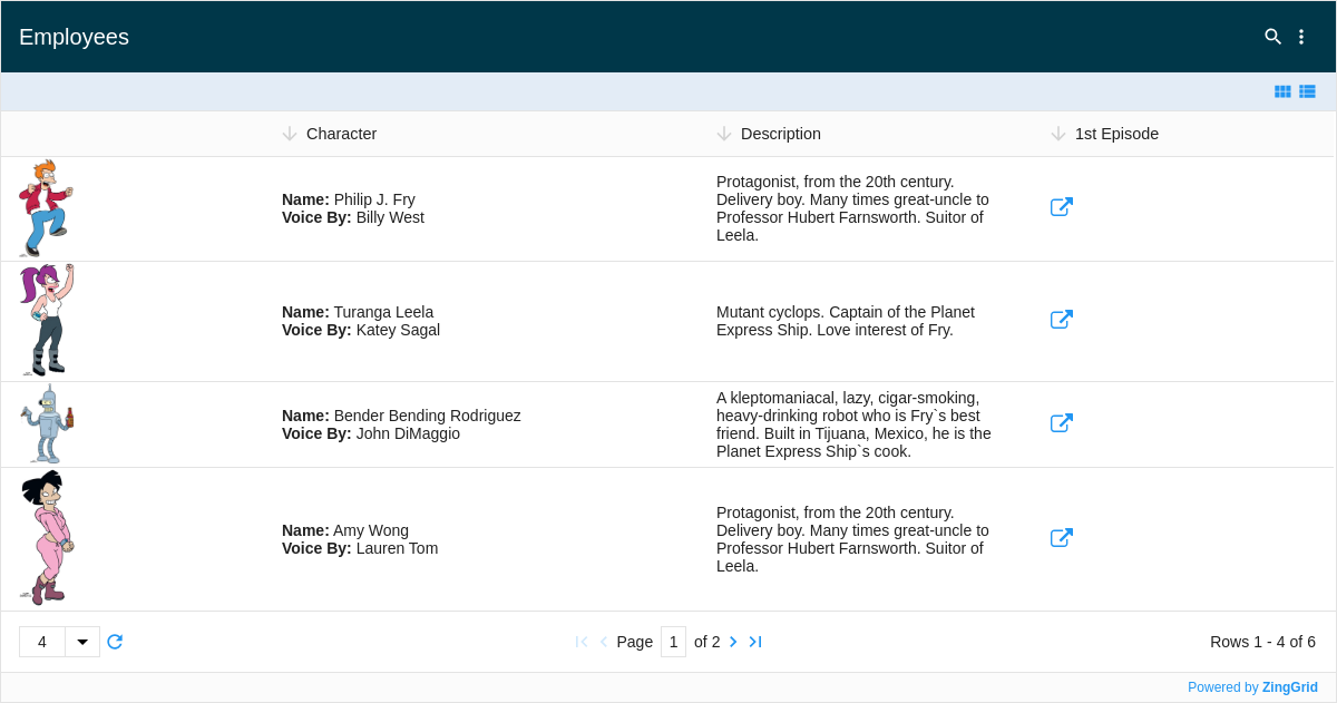
Here is a complete grid showing features added by all three techniques (attributes, tags, and columns) mentioned in this guide:

Moving Forward
You now understand the basics of adding features. If you think you are ready to start styling your grid, read our Styling Basics guide. If you think you need more server and database driven features, check out Retrieving Data from a Local REST API or CRUD Basics.
[getting-started: adding features]