<zg-editor-row>
Version 1
Interactive Storybook Playground
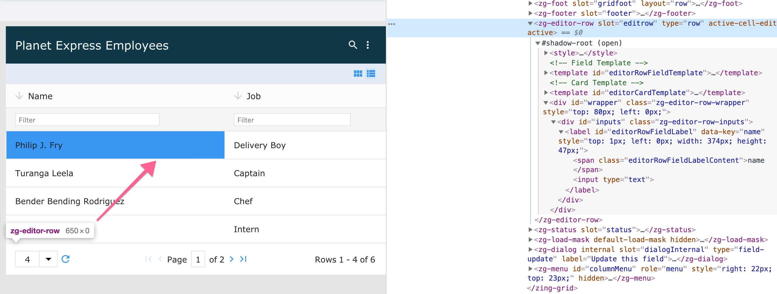
The <zg-editor-row> tag is a web component that holds the details of the edit mode for the grid. <zg-editor-row> is created implicitly by the grid and should be placed directly in the user's HTML. The element can inherently be styled through CSS variables or by targeting the tag directly.

| Component | Relationship | Type | Ancestor |
|---|---|---|---|
| ZingGrid | Parent | Generated | n/a |
Related Web Components
Attributes
There are no attributes available for the <zg-editor-row> web component.
CSS Variables
<zg-editor-row> can be styled with CSS variables, like so:
:root {
--zg-editor-row-input-color: red;
}
Below is a list of all the associated --zg-editor-row CSS variables. Check out the full list of CSS variables or our Styling Basics guide to learn more about styling the grid.
| Name | Default | Description | Demo | CSS Ref |
|---|---|---|---|---|
| --zg-editor-row-input-background | #f5f5f5 | Styles the background of editor row | ||
| --zg-editor-row-input-background_focus | var(--theme-color-lighter) | Styles the background of editor row input on focus | ||
| --zg-editor-row-input-border | 1px solid rgba(82, 168, 236, 0.8) | Styles the border of editor row | ||
| --zg-editor-row-input-border-bottom | var(--zg-editor-row-input-border, 1px solid rgba(82, 168, 236, 0.8)) | Styles the bottom border of editor row | ||
| --zg-editor-row-input-border-left | var(--zg-editor-row-input-border, 0) | Styles the left border of editor row | ||
| --zg-editor-row-input-border-right | var(--zg-editor-row-input-border, 0) | Styles the right border of editor row | ||
| --zg-editor-row-input-border-top | var(--zg-editor-row-input-border, 0) | Styles the top border of editor row | ||
| --zg-editor-row-input-box-shadow_focus | inset 0 0 5px #ccc | Applies a box shadow behind editor row input on focus | ||
| --zg-editor-row-input-color | var(--zg-editor-row-input-color, #fff) | Sets the font color of editor row | ||
| --zg-editor-row-input-padding | 12px 15px | Sets the padding of editor row |
CSS Selector
<zg-editor-row> can be styled by common CSS selectors, like so:
zg-editor-row {
  border: 1px solid red;
}
CSS Shadow Parts
<zg-editor-row> exposed elements within the shadow can be styled by CSS shadow parts, like so:
zg-editor-row::part(editor-row) {
  background-color: red;
}
Below is a list of all the associated ZGEditorRow shadow parts. Check out the full list of CSS shadow parts or our Styling Basics guide to learn more about styling the grid.
| Name | Description |
|---|---|
| editor-row | Editor-row container. |
| inputs | Container for the input fields |
Slots
There are no slots available for the <zg-editor-row> web component.
[api: <zg-editor-row>]