<zg-text>
Version 1
Interactive Storybook Playground
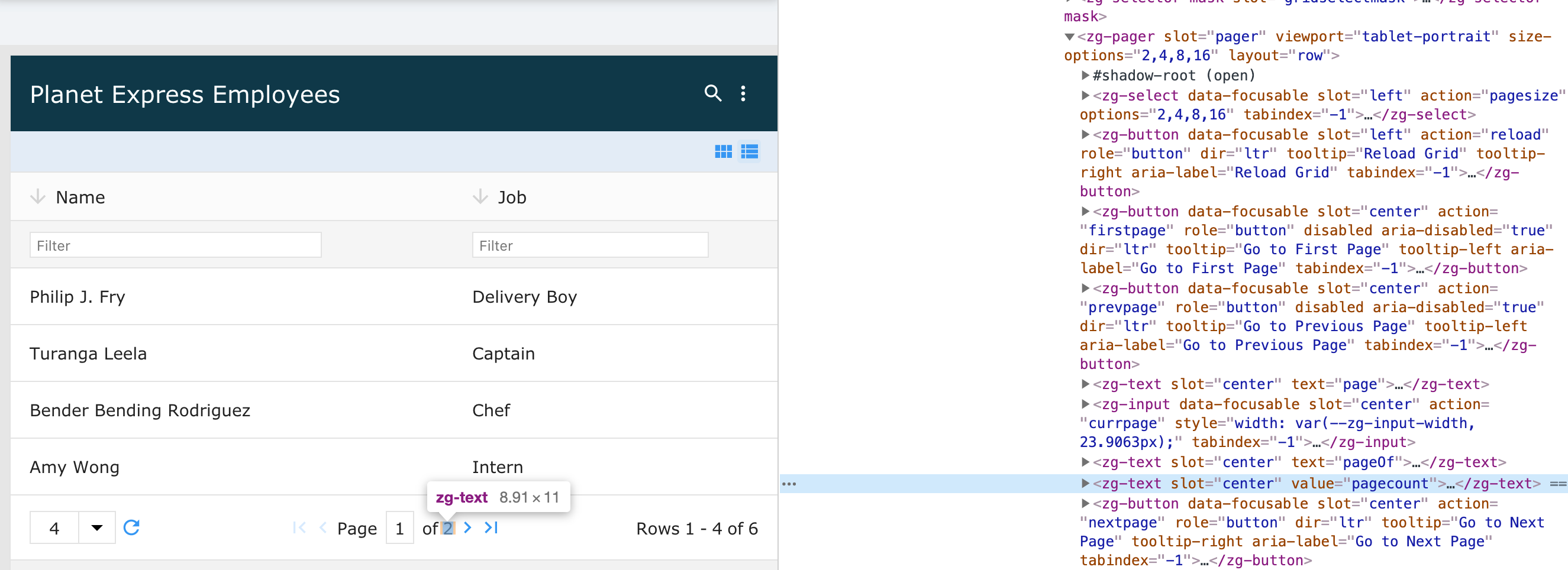
ZingGrid has a predefined set of attribute values to display information about the grid state. <zg-text> is a self-contained web component so you can display the value anywhere in the grid.

Related Web Components
| Component | Relationship | Type | Ancestor |
|---|---|---|---|
| ZGCaption | Parent | Manual | n/a |
| ZGCell | Parent | Generated | ZGBody |
| ZGCard | Parent | Manual | n/a |
| ZGColumn | Parent | Manual | n/a |
| ZGControlBar | Parent | Generated | n/a |
| ZGDialog | Parent | Manual | n/a |
| ZGFooter | Parent | Manual | n/a |
| ZGLayoutControls | Parent | Generated | n/a |
| ZGLoadMask | Parent | Manual | n/a |
| ZGMenu | Parent | Manual | n/a |
| ZGNoData | Parent | Manual | n/a |
| ZGPager | Parent | Generated, Manual | n/a |
Usage
<zg-text> is a ZingGrid specific text value that is bound to the status of the grid, as defined by the value attribute. The field can be manually inserted by a developer, but is more commonly added by the use of certain grid features, like paging. The element can inherently be styled through CSS variables or by targeting the tag directly.
<zing-grid src="https://cdn.zinggrid.com/datasets/user-roles.json">
  <zg-footer>
    <div>
      <span>Showing</span>
      <zg-text value="currpage"></zg-text>
      <span>-</span>
      <zg-text value="pagecount"></zg-text>
      <span>of</span>
      <zg-text value="pagecount"></zg-text>
      <span>rows</span>
    </div>
    <div>
      <zg-button action="prevpage"></zg-button>
      <zg-text value="currpage"></zg-text>
      <zg-button action="nextpage"></zg-button>
    </div>
  </zg-footer>
</zing-grid>
Attributes
There is a value attribute to specify what is generated in the text field.
Type Attribute Values
These are the accepted values for the type attribute:
CSS Variables
<zg-text> can be styled with CSS variables, like so:
:root {
  --zg-text-color: red;
}
Below is a list of all the associated --zg-text CSS variables. Check out the full list of CSS variables or our Styling Basics guide to learn more about styling the grid.
Example Usage
| Name | Default | Description | Demo | CSS Ref |
|---|---|---|---|---|
| --zg-text-color | Browser's default value | Sets the font color of text | ||
| --zg-text-font-family | Browser's default value | Sets the font family of text | ||
| --zg-text-font-size | Browser's default value | Sets the font size of text | ||
| --zg-text-font-style | Browser's default value | Sets the font style of text | ||
| --zg-text-font-weight | Browser's default value | Sets the font weight of text | ||
| --zg-text-line-height | .8 | Sets the line height of text |
CSS Selector
<zg-text> can be styled by common CSS selectors, like so:
zg-text {
  font-size: 2rem;
}

## Slots

`<zg-text>` contains placeholders to allow adding markup inside the component.

```html
<zg-text>Slotted Content</zg-text>
Below is a list of all the associated ZGText slots. Check out the full list of slots.
[api: <zg-text>]