Column Types
By default, the data given to the grid is displayed in cells as text. However, the content might be a path to an image you want to display or a URL link you want to be clickable. Fortunately, ZingGrid comes with a large collection of pre-built column types that handles this for you.
Adding Columns
Adding a type attribute to a column renders the data in a pre-formatted pattern. You can use these to quickly render your content in common formats.
You can add multiple data indexes to a single column, which will render the cell data separated by spaces. To change the separator, add separator to the column with the pattern you want to set. For example, to comma-separate the output, set the value to: <zg-column index="one, two" separator=",">
Aggregate
Adding the aggregate type renders a column of aggregation values specified by typeAggregateValue. The aggregate value is calculated from the numbers
Related Attributes
| Attribute | Description |
|---|---|
| type-aggregate-omit | Precense of this attribute omits the column from aggregate calculations. |
| type-aggregate-value | Sets the token or aggregate method to use in an aggregate column. |
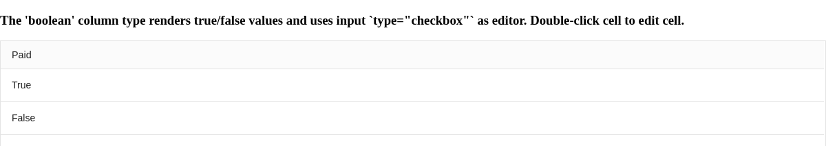
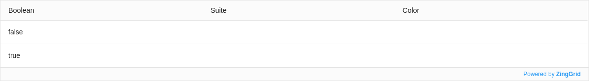
Boolean
The boolean type renders a boolean value and uses a checkbox as an editor.
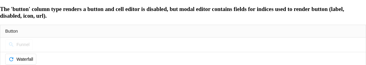
Button
Set the button type is render buttons in the column. Using the supporting attributes listed below to easily disable, add an icon and/or label, and handler to the button.
Related Attributes
| Attribute | Description |
|---|---|
| type-button-disabled | Sets button to be in a disabled state. |
| type-button-handler | Set to name of function to be called when button is clicked. |
| type-button-icon | Sets the icon in button. |
| type-button-label | Sets the label in button. |
| type-button-url | Set to url to open in new window when button is clicked. |
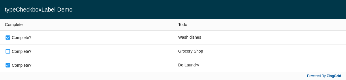
Checkbox
Set the the checkbox type creates a cell that can be toggled. A checkbox will display when you try to edit the cell.
Related Attributes
| Attribute | Description |
|---|---|
| type-checkbox-label | Sets the label next to the checkbox. |
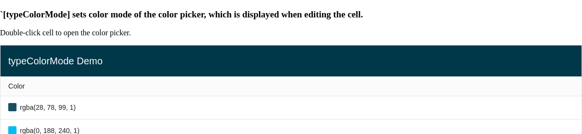
Color
Set the color type to render the preview of the color and display a color picker when editing the cell. The type-color-mode attribute configures the mode of the color picker.
Related Attributes
| Attribute | Description |
|---|---|
| type-color-mode | Sets the color mode to configure the color picker (HSL, RGBA, Hex). |
| type-color-preview | Set to false to disable the default color swatch UI preview. |
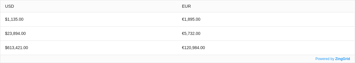
Currency
Set the currency type to format a number into a currency display. By default, the value is displayed in US Dollars. To display a different currency, set the locale and type-currency attributes. Learn more about ZingGrid's internationalization features here.
locale and type-currency only formats the raw number value for display. It does not convert between currency values.
Related Attributes
| Attribute | Description |
|---|---|
| locale | Localization with the column type. |
| type-currency | Set which currency formatting to be used using the three letter code specified by ISO 4217 specification. |
| type-number-decimals | Indicates number of decimal places to display. |
| type-number-max-decimals | Indicates the maximum decimal places to display. |
| type-number-min-decimals | Indicates the minimum decimal places to display. |
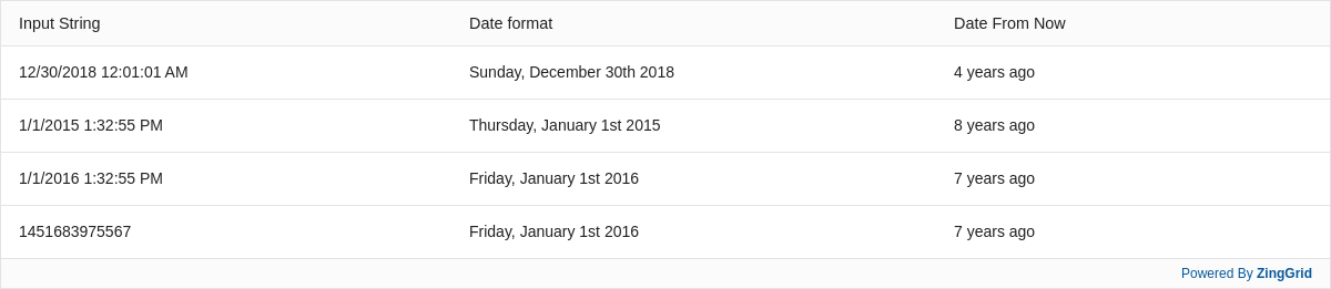
Date
Specifying the date type on a column assigns the date editor to the cells. This tells the grid how to validate the cell value when changed via the editor.
The date type also can format dates or translate it to relative time.
Related Attributes
| Attribute | Description |
|---|---|
| type-date-format | Use tokenized formatting to format the date. |
| type-date-fromNow | Indicates if date from be displayed in relative time. |
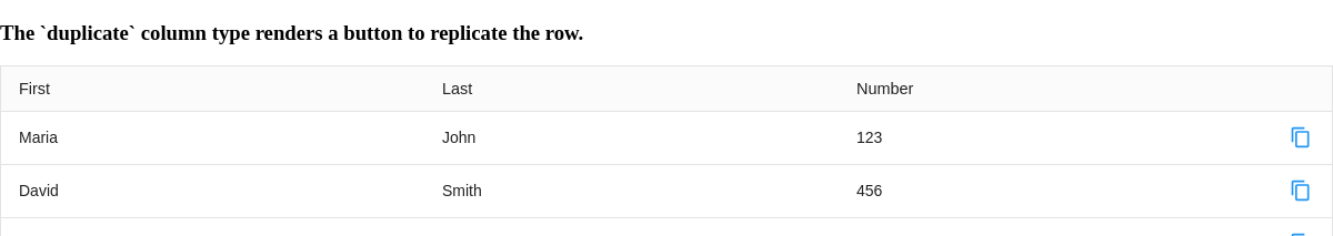
Duplicate
Adding the duplicate type adds the duplicate buttons to duplicate the row.
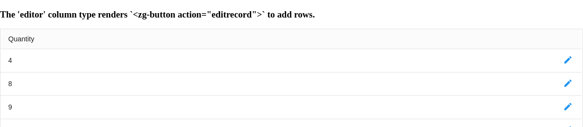
Editor
Adding the editor type adds row editor buttons to edit all cells within the row.
Element
Setting the element type renders the specified element that wraps around the cell content. This feature also extends to custom-elements, allowing you to easily render your own custom elements into the grid!
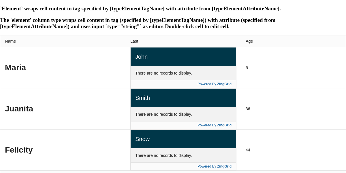
Related Attributes
| Attribute | Description |
|---|---|
| content-style | Sets a style attribute directly on the rendered element. |
| content-width | Sets the width of the content inside of the cell. |
| type-element-attribute-name | Sets the attribute of the custom-element defined in type-element-tag-name. |
| type-element-tag-name | Sets the tag to wrap the content. |
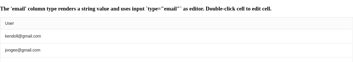
Setting the email type on the column renders the mailto link and tells the grid how to validate the cell value when changed.
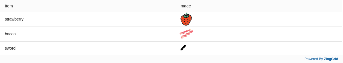
Emoji
Setting the emoji type renders the codepoint to emojis. To additionally render shortcodes, use the type-emoji-shortcode attribute to specify a function to do so.

Related Attributes
| Attribute | Description |
|---|---|
| type-emoji-shortcode | Set to the name of function to convert shortcodes to emojis. |
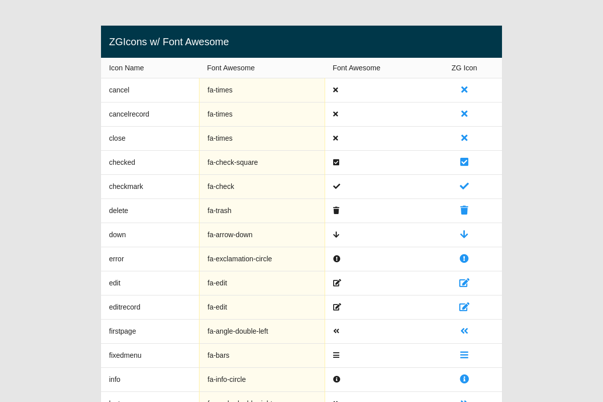
Icon
Set the icon type to convert the cell data into a built-in grid <zg-icon name=""> element. By default, the value must match the name of a native grid icon or the name of a custom icon. You can read more about adding custom icons in the styling section.
You can also set your grid to display icons per an approved icon library, such as Font Awesome. To do so, include the icon library source and then set the [icon-set="fontawesome"] attribute on your ZingGrid instance. Once the grid knows how to render the new icon (in FA's case, it renders an <i> instead of the native grid SVG icon), you can set the cell value to any valid icon name and it should render.
Built-In Grid Icons
The following list shows the built-in grid icons and how they are mapped internally. The last entry, fa-smile-wink, is not a built-in type and showcases how you can display any valid Font Awesome icon.
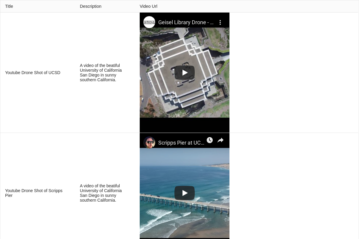
Iframe
Set the iframe type to display data (e.g., videos, maps, etc.) in an inline frame. You can set the alt attribute to assign an alternative text in case the iframe doesn't display. You can also add custom styles by setting the content-style attribute, which emulates the native style inline styling.
Related Attributes
| Attribute | Description |
|---|---|
| contentStyle | Sets a style attribute directly on the rendered element. |
| contentWidth | Sets the width of the content inside of the cell. |
| typeIframeRatio | Sets a square ratio instead of the default 16:9. |
Image
Set the image type to apply the cell data as the <img src=""> 'src' value. You can set the type-image-alt attribute to assign alternative text if images are disabled by the device. You can also add the content-style attribute to add inline styles, which emulates the native style inline styling.
Related Attributes
| Attribute | Description |
|---|---|
| content-style | Sets a style attribute directly on the rendered element. |
| content-width | Sets the width of the content inside of the cell. |
| type-image-alt | Sets the alternative text. |
| type-image-mask | Sets the shape to mask the image. |
| type-image-src | Sets the src of the image. |
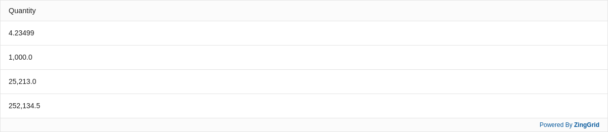
Number
Specifying the number type on a column assigns the number editor to the cells. This tells the grid how to validate the cell value when changed via the editor.
The number type by default formats the number as a thousand's separated string, but can also format the number as a decimal. This is the default type for any number cell value.
Related Attributes
| Attribute | Description |
|---|---|
| type-number-decimals | Indicates number of decimal places to display. |
| type-number-formatting | Set to "disabled" to turn off default number formatting. |
| type-number-max-decimals | Indicates the maximum decimal places to display. |
| type-number-min-decimals | Indicates the minimum decimal places to display. |
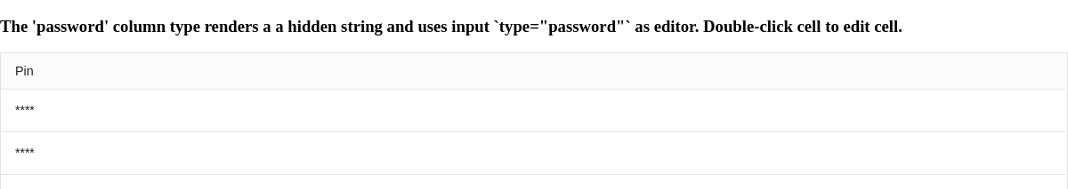
Password
Enabling the password type hides the text behind asterisks (***).
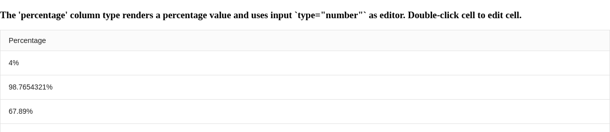
Percentage
Enabling the percentage type renders the number as a percentage string value.
Related Attributes
| Attribute | Description |
|---|---|
| type-number-decimals | Indicates the number of decimal places to display in a percentage. |
| type-number-max-decimals | Indicates the maximum decimal places to display in a percentage. |
| type-number-min-decimals | Indicates the minimum decimal places to display in a percentage. |
Radio
Setting the radio type on a column assigns the radio editor to the cells. Specified radio options will displayed when you edit the cell.
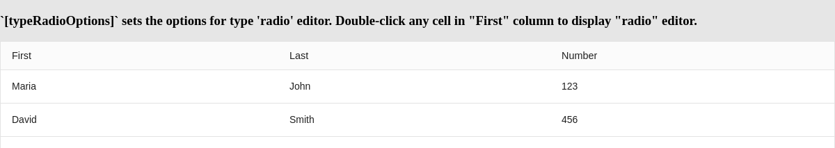
Related Attributes
| Attribute | Description |
|---|---|
| type-radio-options | Adds rendered radio options to the cell. |
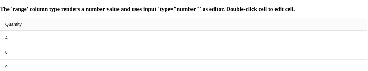
Range
Specifying the range type on a column assigns the number editor to the cells. This tells the grid how to validate the cell value when changed via the editor.
The number is formatted as a thousand's separated string value.
Optionally, use the attributes below to set the minimum, maximum, and step when changing the values using the up/down keys.
Related Attributes
| Attribute | Description |
|---|---|
| type-range-max | Maximum value for the input box. |
| type-range-min | Minimum value for the input box. |
| type-range-step | Specifies the step value between each legal value for the input box. |
Record Duplicate
The record-duplicate type adds record-duplicate buttons to duplicate the row.
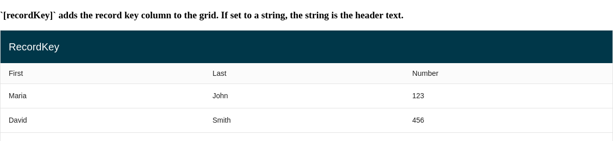
Record Key
The record-key type appends a row
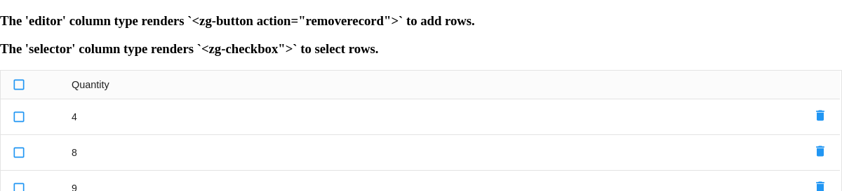
Remover
Adding the remover type adds remover buttons to remove the row.
Row Group
The row-group type can be used two ways:
- Enables row grouping by adding the row group column type. The field indices to group by are determined by the
[group]or[index]attributes. - References the row group column type created by
ZingGrid[groupBy](an alternative way to enable row grouping).
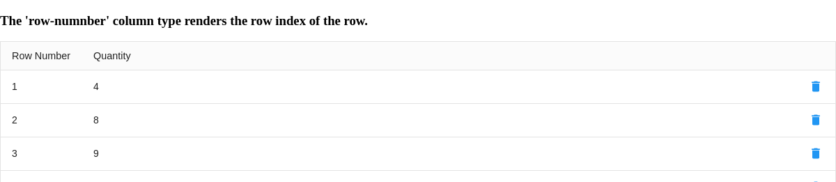
Row Number
The row-number type renders a field to display the index of the row.
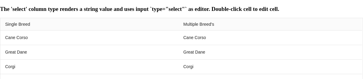
Select
When setting the select type, this creates the <select> element when editing the cell. You can then use the type-select-options attribute to set the dropdown options. Making a selection will set the cell data to that new value. Add the type-select-multiple attribute to display a multi-select <select> dropdown. Per the MDN specification, users must hold ctrl, cmd, or shift to select multiple options.
Related Attributes
| Attribute | Description |
|---|---|
| type-select-default-value | Sets the defaults value of a new record. |
| type-select-multiple | In edit mode, allows multiple selections. |
| type-select-options | Sets the options of the select box. |
Selector
Adding the selector type adds a column of checkboxes to enable selecting rows. With editing enabled, the selection of rows can be removed with one click.
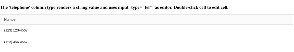
Tel
Setting the tel type assigns the [type="tel"] attribute of the editor's <input>.
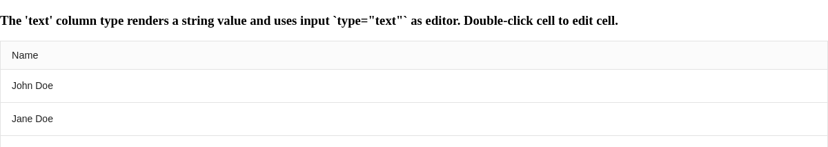
Text
The text type is the default type for string values. This assigns a text editor to the cell.
Toggle
Enable toggling on a column by setting the toggle type. Add the type-toggle-options attribute to set the options for true/false.
Related Attributes
| Attribute | Description |
|---|---|
| type-toggle-options | Sets the list of options for the display. |
| type-toggle-render-value | Set to make the render and value the same to prevent the default true/false values. |
Slotted Content
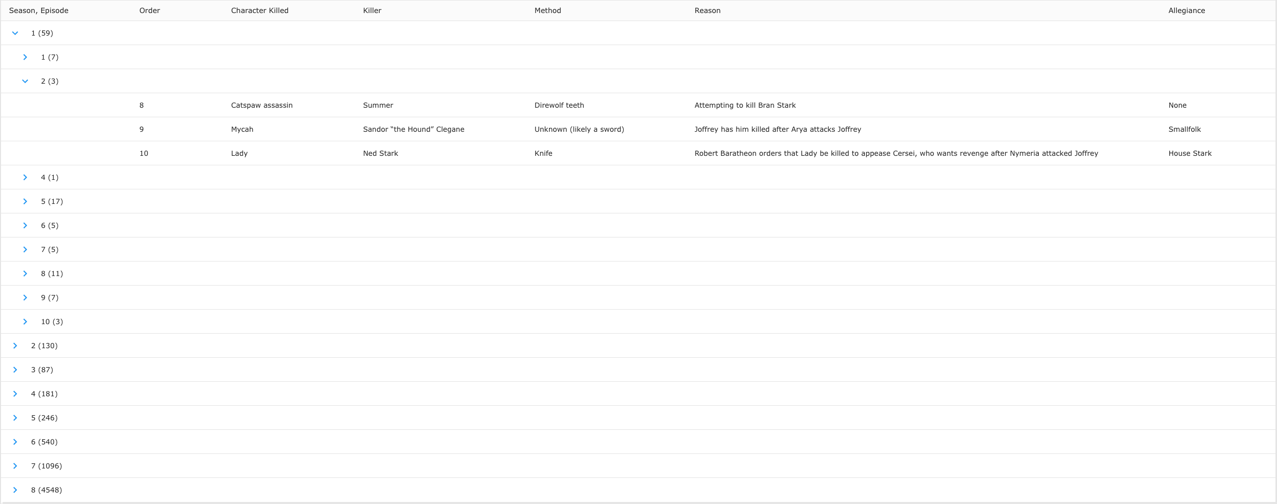
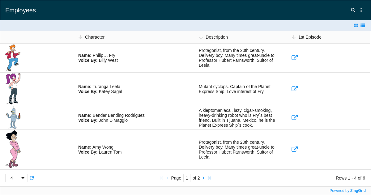
One of ZingGrid's most powerful features allows you to easily create custom columns with slotted content. This is a great way to customize individual columns and consolidate columns as well. Slotted content just means putting markup inside a <zg-column> tag. Inside that column, you have access to the index data through our templating system [[index.key]]. You also have access to all data through [[record.key]].
In the example below, we've applied custom columns to the "Character" and "1st Episode" columns to style and render the information in a cleaner, more readable layout:
<zg-colgroup>
  <zg-column index="img" header=" " type="image" cell-class="profile-avatar" content-width="50px" sort="disabled"></zg-column>
  <zg-column index="name,actor" header="Character" cell-class="character-info">
    <span class="character-info--header"><strong>Name:</strong> [[index.name]]</span>
    <br>
    <span class="character-info--subheader"><strong>Voice By:</strong> [[index.actor]]</span>
  </zg-column>
  <zg-column index="description" width="300"></zg-column>
  <zg-column header="1st Episode" index="episode_link" type="url" type-url-icon="outsidearrow" >
  </zg-column>
</zg-colgroup>
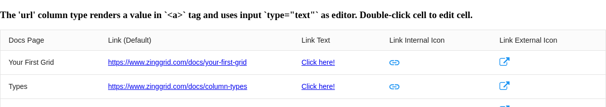
URL
Add a link by setting the url type. Then you can assign the text to click on by setting the attribute, type-url-text.
Related Attributes
| Attribute | Description |
|---|---|
| content-style | Sets a style attribute directly on the rendered element. |
| content-width | Sets the width of the content inside of the cell. |
| type-url-icon | Reference a ZGIcon within library to replace the link text with specified icon. |
| type-url-src | Sets the src for the link. |
| type-url-target | Sets the a[target] value of the url. |
| type-url-text | Sets the text displayed for the link. |
Custom type
If none of these column types meet your needs, you can set the custom type and create a column that works for you.
Custom Columns Grid

[guides: column]