Mobile
ZingGrid is responsive and mobile-ready by default!
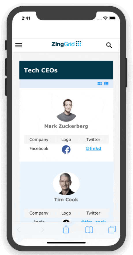
Responsive Layouts
ZingGrid automatically switches from row mode to card mode on smaller screens, like so:
Top
Horizontal Scroll
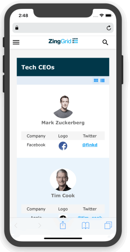
You can also switch back to row mode through the layout menu. While in row mode, simply scroll horizontally to view more.
Top
Related Resources
Here are some extra resources related to this feature to help with creating your grid:
[features: mobile]