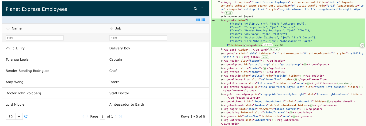
<zg-data>
Interactive Storybook Playground
The <zg-data> tag is a web component that controls data associated to the grid. As an non-visual element, you should not apply style to this tag.

| Component | Relationship | Type | Ancestor |
|---|---|---|---|
| ZingGrid | Parent | Manual | n/a |
| ZGParam | Child | Manual | n/a |
Related Web Components
Usage
A <zg-data> tag will always be implicitly used by the grid; when using top level data and src tags, a <zg-data> is created behind the scenes.
<zing-grid src="https://cdn.zinggrid.com/datasets/user-roles.json">
</zing-grid>
The following markup is the same as the HTML above:
<zing-grid>
  <zg-data src="https://cdn.zinggrid.com/datasets/user-roles.json"></zg-data>
</zing-grid>
If you have a more complex use case that requires headers and arguments to be passed to the server containing your src, then <zg-data> and <zg-param>(s) will be used. <zg-data>should be employed and various configuration values set via the options attribute, or more appropriately, via <zg-param> tags nested within the tag.
<zing-grid
    pager
    page-size="5"
    layout="row"
    layout-controls="disabled"
    viewport-stop>
    <zg-caption>
      ZingGrid Star Wars Server Paging
      <span class="button" id="reloadBtn">Reload Demo</span>
    </zg-caption>
    <zg-data>
      <!-- define the main source for the API -->
      <zg-param name="src" value="https://swapi.py4e.com/api/people/"></zg-param>

      <!-- define the path in the JSON to get the array of results.
          In this case it is body.results -->
      <zg-param name="recordPath" value="results"></zg-param>

      <!-- if loadByPage is set to true it will go to the
        server for each new page of data -->
      <zg-param name="loadByPage" value="true"></zg-param>

      <!-- define the "page" query parameter -->
      <zg-param name="pageKey" value="page"></zg-param>

      <!-- Need to tell ZG how many records were returned so it knows
          how to divide up the page-size -->
      <zg-param name="countPath" value="count"></zg-param>

      <!-- define the path in the result JSON to find next/prev urls -->
      <zg-param name="nextPath" value="next"></zg-param>
      <zg-param name="prevPath" value="previous"></zg-param>

    </zg-data>
    <zg-colgroup>
      <zg-column index="name"></zg-column>
      <zg-column index="height"></zg-column>
      <zg-column index="mass"></zg-column>
      <zg-column index="hair_color"></zg-column>
      <zg-column index="eye_color"></zg-column>
      <zg-column index="skin_color"></zg-column>
    </zg-colgroup>
  </zing-grid>
Attributes
There are a couple attributes for <zg-data> that are used to create adapters, parameters and arguments when fetching your data source.
Example Usage
<zing-grid>
  <zg-data src="https://cdn.zinggrid.com/datasets/user-roles.json"></zg-data>
</zing-grid>
Description
Adapter is a shortcut to set known options for specific third party datasets. Currently supports graphql and firebase.
Developers could register their own custom adapters. For more information on custom adapters, visit Guides > ZingGrid Object > registerAdapter().
Default Value
""
Accepted Values
-
"firebase" -
"graphql"
Description
Data for the grid presented as an array or object. If set as an attribute value, the data needs to be in JSON format.
Default Value
""
Accepted Values
-
[{"firstName": "John", "lastName": "Doe"}]
Description
In the case of non-key based objects, the idKey can be set to indicate the id to send back to the datasource on CRUD commands. For example, if the READ URL was https://zinggrid-named.firebaseio.com/ then the UPDATE would be https://zinggrid-named.firebaseio.com/VALUE_OF_IDKEY.
Default Value
"id"
Accepted Values
-
"state"
Description
Used to set <zg-param>, the configuration data for <zg-data>. This should never be used directly as an attribute and
is meant for object instantiation and for setting in JavaScript.
Default Value
{}
Accepted Values
-
{"idKey":"state","sortDirKey":"_order","sortDir":"desc","sortByKey":"_sort","sortBy":"capital","src":"https://zinggrid-named.firebaseio.com/"}
CSS Variables
There are no CSS variables available for the <zg-data> web component.
CSS Selector
As an non-visual element, you should not apply style to this tag.
Slots
<zg-data> contains placeholders to allow adding markup inside the component.
<zg-data><zg-param></zg-param></zg-data>
Below is a list of all the associated ZGData slots. Check out the full list of slots.
| Name | Description | Demo |
|---|---|---|
| Data content that only accepts data configuration options (ZGParams). |
[api: <zg-data>]