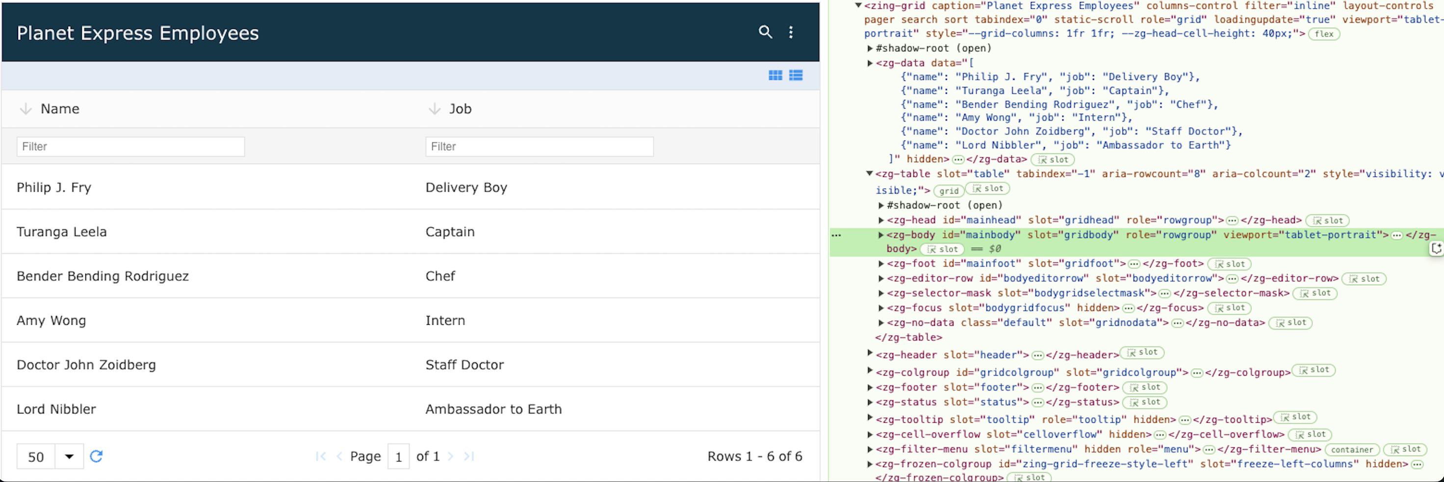
<zg-body>
Interactive Storybook Playground
The <zg-body> tag is created dynamically by the ZingGrid library and as such, should not be manually added by the developer. However, the user can style <zg-body> through CSS variables or by targeting the tag directly.

| Component | Relationship | Type | Ancestor |
|---|---|---|---|
| ZGTable | Parent | Generated | n/a |
| ZGRow | Child | Generated | n/a |
Related Web Components
Attributes
There are no attributes available for the <zg-body> web component.
Top
CSS Variables
<zg-body> can be styled by common CSS variables, like so:
:root {
  --zg-body-background: red;
}
Below is a list of all the associated --zg-body CSS variables. Check out the full list of CSS variables or our Styling Basics guide to learn more about styling the grid.
| Name | Default | Description | Demo | CSS Ref |
|---|---|---|---|---|
| --zg-body-background | transparent | Styles the background of grid body | ||
| --zg-body-border | 0 | Styles the border of grid body | ||
| --zg-body-border-bottom | var(--zg-body-border, 0) | Styles the bottom border of grid body | ||
| --zg-body-border-left | var(--zg-body-border, 0) | Styles the left border of grid body | ||
| --zg-body-border-right | var(--zg-body-border, 0) | Styles the right border of grid body | ||
| --zg-body-border-top | var(--zg-body-border, 0) | Styles the top border of grid body. Note: If `--zg-row-border-top` set, it will override `--zg-body-border-top`. | ||
| --zg-body-card-background | linear-gradient(45deg, #f9fafb 20%, #fff) | Styles the background of grid body in 'card' layout-mode | ||
| --zg-body-card-border | 0 | Styles the border of grid body in 'card' layout-mode | ||
| --zg-body-card-border-bottom | var(--zg-body-card-border, 0) | Styles the bottom border of grid body in 'card' layout-mode | ||
| --zg-body-card-border-left | var(--zg-body-card-border, 0) | Styles the left border of grid body in 'card' layout-mode | ||
| --zg-body-card-border-right | var(--zg-body-card-border, 0) | Styles the right border of grid body in 'card' layout-mode | ||
| --zg-body-card-border-top | var(--zg-body-card-border, 0) | Styles the top border of grid body in 'card' layout-mode. Note: If `--zg-row-border-top` set in 'card' layout-mode it will override `--zg-body-border-top`. | ||
| --zg-body-card-display | grid | Sets display of grid body in 'card' layout-mode | ||
| --zg-body-color | inherit | Sets the font color of contents inside grid body | ||
| --zg-body-font-family | inherit | Sets the font family of contents inside grid body | ||
| --zg-body-font-size | inherit | Sets the font size of contents inside grid body | ||
| --zg-body-font-style | inherit | Sets the font style of contents inside grid body | ||
| --zg-body-font-weight | inherit | Sets the font weight of contents inside grid body | ||
| --zg-body-line-height | inherit | Sets the line-height of contents inside of grid body |
Top
CSS Selector
As a non-visual element, you should not apply styles to this tag.
Top
Slots
There are no slots available for the <zg-body> web component.
Top
[api: <zg-body>]