Layouts
ZingGrid automatically resizes your columns and changes from row to card layout in smaller browsers. You can also easily switch your grid between the layouts by setting the layout attribute on the <zing-grid> tag.
Default
ZingGrid is responsive by default, and changes from row to card layout depending on your screen size. Resize your browser to see the change in the grid below!
Row
If you don't want ZingGrid to switch between layouts when you resize your screen, you can force a row layout with the [layout="row"] attribute on the <zing-grid> tag (see below). If you don't want users to have the option to toggle between row and card mode at all, add [layout-controls="disabled"] to the <zing-grid> tag.
<zing-grid layout="row"></zing-grid>
Row Layout Grid
Here is a complete grid that stays in row layout even when you resize the browser:
Card
If you don't want ZingGrid to switch between layouts when you resize your screen, you can force a card layout with the [layout="card"] attribute on the <zing-grid> tag (see below). If you don't want users to have the option to toggle between row and card mode at all, add layout-controls="disabled" to the <zing-grid> tag.
<zing-grid layout="card"></zing-grid>
Card Layout Grid
Here is a complete grid that stays in card layout even when you resize the browser:
Controls
To hide the controls that toggle between row mode and card mode, set the [layout-controls=false] attribute on the <zing-grid> tag, like so:
<zing-grid layout-controls="disabled"></zing-grid>
Disabled Layout Controls Grid
Here is a complete grid with the control to toggle between card mode and row mode disabled:
Viewport Pause
You can also pause the grid from switching layouts with the viewport-pause attribute on the
<zing-grid viewport-pause></zing-grid>
You can set viewport-pause to keep the current value of viewport (even on refresh), but resizing the device will not update the attribute value, thus freezing the breakpoint until you remove the viewport-pause attribute. Learn more about viewports here.
Viewport Paused Grid
Here is a complete grid with the viewport paused:
Viewport Stop
You can also stop the grid from switching layouts with the viewport-stop attribute on the <zing-grid> tag, like so:
<zing-grid viewport-stop></zing-grid>
You can set viewport-stop to remove the viewport attribute completely, which means the viewport process will no longer run on device resize.
Viewport Stopped Grid
Here is a complete grid with viewport stopped:
Viewport Types
You can define your own breakpoints with the viewport-types attribute on the <zing-grid> tag (see below). You will have to style the grid based on the viewport selector.
<zing-grid
  caption="Top LiverPool Forwards"
  viewport-types='
    {
      "mobile": 600,
      "bob": 875,
      "desktop": 1200,
      "desktop-large": 1600,
      "test": 2000
    }
  '
>
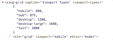
If you don't add a breakpoint with key "mobile", it won't switch between card and row layout-mode automatically. Adding custom breakpoints replaces the defaults instead of combining the two.
The custom-type object must be valid JSON, hence the use of single-quotes in the above example for the attribute's value. This allows the use of double-quotes for the object key/values.
Custom Viewport Breakpoints Grid
Here is a complete grid with custom breakpoints for resizing:
Related Resources
Here are some extra resources related to this feature to help with creating your grid:
[features: layouts]