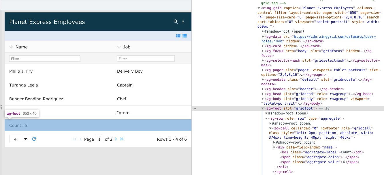
<zg-foot>
Version 1
Interactive Storybook Playground
The <zg-foot> tag contains the foot cells (<zg-foot-cell>) of the data grid specified via the foot-cell attribute found on <zg-column> tags. The tag roughly corresponds to the idea of the <tfoot> tag used in HTML tables. The <zg-foot> tag is generated by the library and should not be placed in a grid manually by a user. The footer cell is styleable via CSS variables or the zg-foot CSS selector.

| Component | Relationship | Type | Ancestor |
|---|---|---|---|
| ZingGrid | Parent | Generated | n/a |
| ZGRow | Child | Generated | n/a |
Related Web Components
Usage
The <zg-foot> element is a generated element added to <zing-grid> when the selector attribute is defined.
<zing-grid selector
  src="https://cdn.zinggrid.com/datasets/user-roles.json">
</zing-grid>
Attributes
There are no attributes available for the <zg-foot> web component.
CSS Variables
<zg-foot> can be styled with CSS variables, like so:
:root {
--zg-foot-border-top: 1px solid red;
}
Below is a list of all the associated --zg-foot CSS variables. Check out the full list of CSS variables or our Styling Basics guide to learn more about styling the grid.
| Name | Default | Description | Demo | CSS Ref |
|---|---|---|---|---|
| --zg-foot-background | Browser's default value | Styles the background of grid foot | ||
| --zg-foot-border | 0 | Styles the border of grid foot | ||
| --zg-foot-border-bottom | var(--zg-foot-border, 0) | Styles the bottom border of grid foot | ||
| --zg-foot-border-left | var(--zg-foot-border, 0) | Styles the left border of grid foot | ||
| --zg-foot-border-right | var(--zg-foot-border, 0) | Styles the right border of grid foot | ||
| --zg-foot-border-top | var(--zg-foot-border, 0) | Styles the top border of grid foot | ||
| --zg-foot-height | auto | Sets the height of grid foot | ||
| --zg-foot-padding | 0 | Sets the padding of grid foot |
CSS Selector
<zg-foot> can be styled by common CSS selectors, like so:
zg-foot {
  border-top: 1px solid red;
}
Slots
There are no slots available for the <zg-foot> web component.
[api: <zg-foot>]