The ZingGrid API
ZingGrid defines a set of Custom Elements (tags) that you can use to construct a data table or interactive grid. As a set of custom elements, ZingGrid tags natively use standard CSS properties and attributes, react to JavaScript events, and act as you would expect normal HTML tags to behave.
Overview
ZingGrid supports a rich and nearly unobtrusive API that leverages what web developers already know - the native DOM API! Treat ZingGrid elements just as you would any standard HTML element, including:
- Select elements using standard selectors like
document.querySelector()or jQuery's$ - Apply CSS for styling, showing/hiding content, or even adding transitions
- Add event listeners using native
addEventListener()calls
Since we are a native web component, you can even bind ZingGrid with popular frameworks quite easily. Click each framework below for integration directions:
When binding data, use your framework or make calls to endpoints directly with ZingGrid.
We support Standard REST and Firebase directly with almost zero configuration. If you do things in a non-standard way, don't worry. ZingGrid is customizable and lets you do all the overwrites you need. Check out the examples below, and then explore our docs!
Automatic REST API Binding
ZingGrid automatically does REST bindings for you so that actions on your grid (insert, edit, and delete) are connected to your dataset.
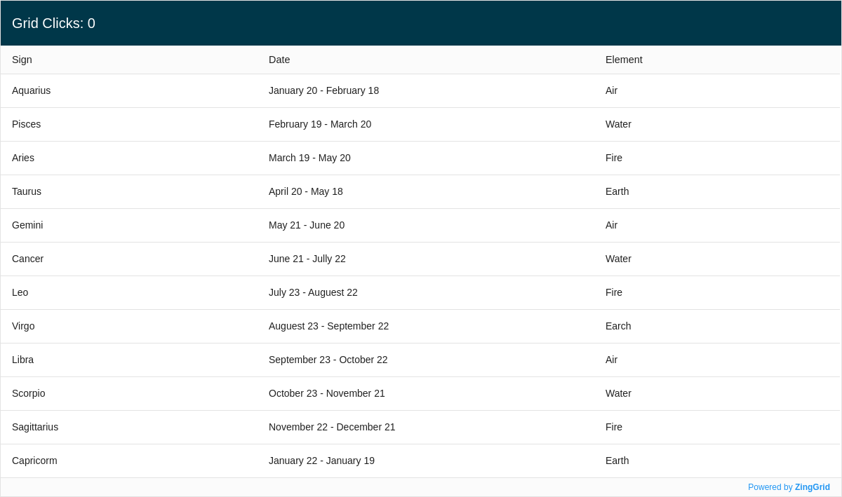
Methods and Events API
ZingGrid comes with its own events and methods to provide flexibility in handling interactions with your grid. In our demo, we use the cell:click event and the setCaption() method to update the counter shown on the caption.
Built-in Endpoint Adapter
ZingGrid makes it easy to connect Firebase to your grid. It sets up properties for you, from pagination to direct cell-data editing. There are many more adapters coming soon!
Custom Endpoints
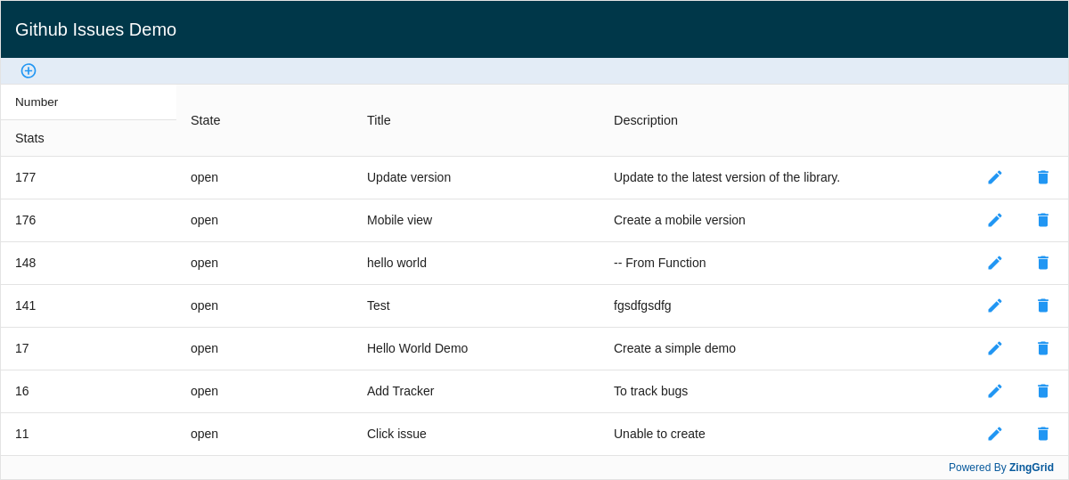
ZingGrid also makes it easy to connect your grid to custom endpoints, like GitHub.
Tag Usage
ZingGrid tags are an extension of native HTML and are used like any other tag:
<zing-grid data='[{"firstName":"John", "lastName":"Doe"}, {"firstName":"Jane", "lastName":"Doe"}]'>
  <zg-caption>Hello ZingGrid</zg-caption>
</zing-grid>
Since they are HTML tags, they support common attributes like id, class, title, etc. For built-in grid functionality, you simply add attributes to enable functionality.
Check out the full list of ZingGrid tags and the full list of HTML attributes.
Attribute Usage
As extensions of native HTML elements, ZingGrid tags accept data attributes. Custom, predefined attributes are used to control the behavior of the grid, from quickly adding a styled caption-label to enabling search, sorting, and pagination:
<zing-grid
  data='[{"firstName":"John", "lastName":"Doe"}, {"firstName":"Jane", "lastName":"Doe"}]'
  caption="Hello ZingGrid"
  pager
  search
  sorter
></zing-grid>
When the grid is rendered, the feature attributes are evaluated and the matching DOM markup is constructed and added automatically.
Note: Some elements are auto-generated during the render process. They are listed on the <zing-grid> page but are not intended for manual use. If the element has no public attributes listed, this is a good indicator that it is added automatically for you.
[api: intro]