<zg-calendar-selection>
Interactive Storybook Playground
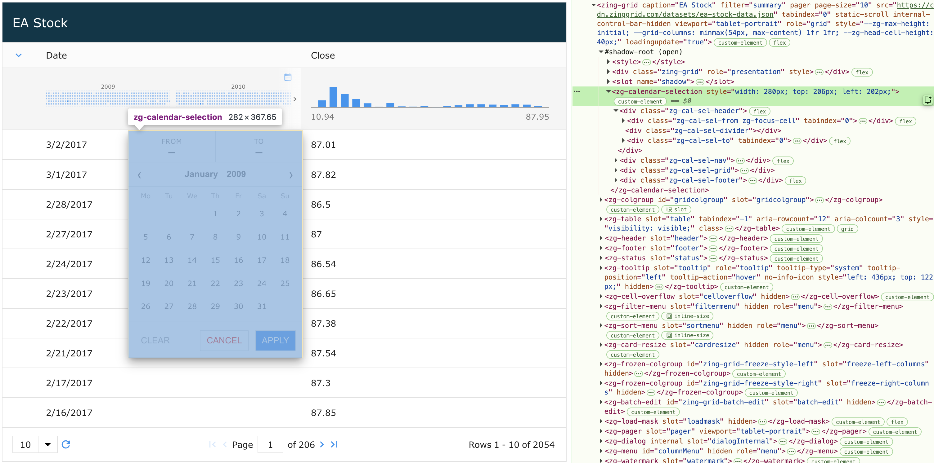
The <zg-calendar-selection> tag is a web component that controls the functionality and styling for the date range picker overlay that appears when clicking the calendar selection button in a filter summary row. It allows users to select a "From" and "To" date range to filter date-type columns. This web component is dynamically inserted by the grid and can be styled by CSS variables or the zg-calendar-selection CSS selector.
Related Web Components
Usage
<zg-calendar-selection> is automatically inserted when a date-type column is using the calendar filter summary chart and the user clicks the calendar selection button in that column's filter summary row.
<zing-grid
  filter="summary"
  src="...">
  <zg-column index="name"></zg-column>
  <zg-column index="startDate" type="date" filter-summary-chart="calendar"></zg-column>
</zing-grid>
Check out the Filtering Summary Chart documentation to learn more about the calendar chart type.
Attributes
There are no attributes available for the <zg-calendar-selection> web component.
CSS Variables
<zg-calendar-selection> can be styled with CSS variables, like so:
:root {
  --zg-calendar-selection-background: red;
}
Below is a list of all the associated --zg-cal-sel CSS variables. Check out the full list of CSS variables or our Styling Basics guide to learn more about styling the grid.
| Name | Default | Description | Demo | CSS Ref |
|---|
CSS Selector
<zg-calendar-selection> can be styled by common CSS selectors, like so:
zg-calendar-selection {
  border: 1px solid red;
}
Slots
There are no slots available for the <zg-calendar-selection> web component.
[api: <zg-calendar-selection>]