<zg-card-resize>
Interactive Storybook Playground
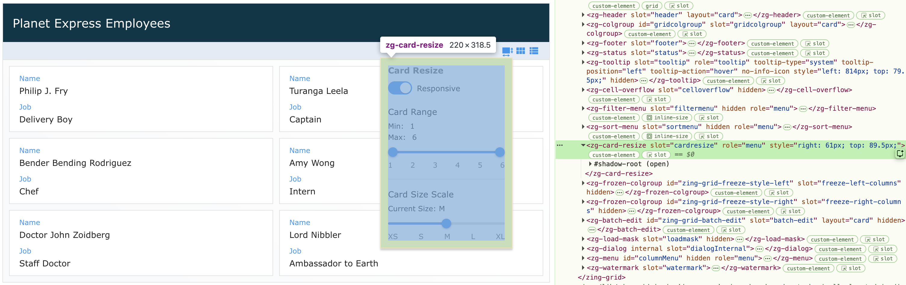
The <zg-card-resize> tag is the container for the menu that appears when clicking on the control bar's card resize button. It is used as a
CSS target for styling by the developer. The <zg-card-resize> web component should not be accessed specifically beyond styling.
Related Web Components
Usage
The <zg-card-resize> element is a generated element added to <zing-grid> when the card-resizable attribute is defined and the grid is set to layout="card". It opens a menu, from the control bar's card resize button, that lets the user pick between a "Responsive" card size range (a Min/Max cards-per-row range with a preferred size scale) and a "Fixed" single cards-per-row size.
<zing-grid layout="card" card-resizable
  src="https://cdn.zinggrid.com/datasets/user-roles.json">
</zing-grid>
The card-resizable attribute also accepts a "fixed" value, which starts the menu in "Fixed" mode instead of the default "Responsive" mode.
<zing-grid layout="card" card-resizable="fixed"
  src="https://cdn.zinggrid.com/datasets/user-roles.json">
</zing-grid>
Attributes
There are no attributes available for the <zg-card-resize> web component.
CSS Variables
<zg-card-resize> can be styled with CSS variables, like so:
:root {
  --zg-card-resize-background: red;
}
Below is a list of all the associated --zg-card-resize CSS variables. Check out the full list of CSS variables or our Styling Basics guide to learn more about styling the grid.
| Name | Default | Description | Demo | CSS Ref |
|---|
CSS Shadow Parts
<zg-card-resize> exposed elements within the shadow can be styled by CSS shadow parts, like so:
zg-card-resize::part(header) {
  background-color: red;
}
Below is a list of all the associated ZGCardResize shadow parts. Check out the full list of CSS shadow parts or our Styling Basics guide to learn more about styling the grid.
| Name | Description |
|---|
Slots
There are no slots available for the <zg-card-resize> web component.
[api: <zg-card-resize>]